When clients walk into our workshop here in Los Angeles, the first thing they want to touch is the texture of the fabric. But the first thing they think over is the color. It makes sense. When you invest in a custom piece of furniture—whether it’s a sprawling sectional for your living room or a set of statement chairs for a hotel lobby—you are committing to a visual anchor that will define that space for years.
Choosing a color isn’t just about picking your favorite shade of blue. It’s a strategic decision that involves lighting, lifestyle, and the specific atmosphere you’re trying to build. Over the years, we’ve upholstered everything from bright velvet fainting couches to subtle grey linen slipcovers, and we’ve learned that the “best” color is entirely dependent on the life the sofa is going to lead.
Start with the Mood, Not the Swatch
Before you even look at a fabric book, ask yourself how you want the room to feel. Color is the primary driver of mood in interior design. If you are aiming for a sanctuary where you can decompress after navigating L.A. traffic, you’re likely looking for colors that recede rather than demand attention.
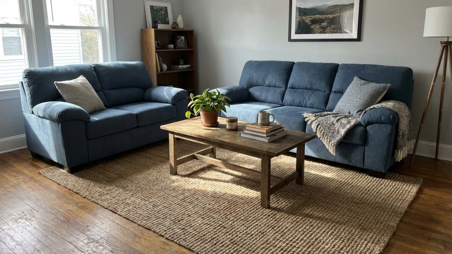
Neutral tones like beige, taupe, soft greys, and creamy whites are incredibly popular for a reason. They create a calm, sophisticated backdrop that allows you to change your accent decor seasonally without clashing. A white linen sofa says “breezy California casual” instantly. However, if the room is meant to be a high-energy entertainment space or a moody cocktail lounge, neutrals might feel too passive. Deep jewel tones like emerald green, navy blue, or a rich burgundy can make a room feel cozy, intimate, and luxurious.
The “Location, Location, Location” Rule
Where is this sofa going to live? The physical location within your home or business dictates the color limitations.
Direct Sunlight Issues
If your custom sofa is destined for a sunroom or a living area with floor-to-ceiling windows facing west, you have to be careful with dark, natural fabrics. Sunlight is a bleaching agent. A deep navy cotton velvet exposed to intense daily sun will eventually fade into a purplish-grey. In these high-light areas, lighter colors are far more forgiving. Fading is much less noticeable on a cream or oatmeal fabric than on a black one. If you absolutely must have a dark color in a sunny room, we usually recommend high-performance synthetic blends that are solution-dyed, as they resist UV fading much better than natural fibers.
High-Traffic Areas
Is this sofa going in the “formal living room” that nobody is allowed to enter, or is it going in the family room where the dog sleeps and the kids eat pizza?
For high-traffic family rooms, we generally advise against the extremes. Pure white is risky for obvious reasons, but pure black is also surprisingly difficult because it shows every speck of dust, pet hair, and lint. The sweet spot for a heavily used custom sofa is usually a mid-tone. Greys, browns, and textured tweeds are excellent specifically because they camouflage life’s little messes. If you have a golden retriever, a camel-colored velvet might be your best friend. If you have a black cat, charcoal grey is the way to go.
Wall Color Coordination
One common trap we see homeowners fall into is trying to match the sofa perfectly to the wall color. While a monochromatic look can be very chic if done by a professional designer, it often results in the furniture disappearing into the background, making the room feel flat.
Instead of matching, think about contrast.
If you have dark, moody walls—say, a deep slate blue—a sofa in a lighter leather or a bright contrasting fabric will pop beautifully. Conversely, if you have standard “apartment white” walls, a beige sofa might look washed out unless you introduce significant texture. In that case, a darker sofa grounds the room and provides a focal point.
The Psychology of Space
The visual weight of a color changes how big a piece of furniture looks. This is crucial for custom sizing. If you are ordering a massive sectional for a somewhat small room, upholstering it in a very dark, heavy color (like dark chocolate or black) absorbs light and makes the piece look larger and more imposing. It can dominate the room to the point where the space feels cramped.
If you are trying to maximize the feeling of space in a smaller Los Angeles apartment, matching the sofa color closely to the wall color (or keeping it very light) allows the eye to travel across the room uninterrupted. Light colors reflect light, making the sofa feel airier and less bulky, even if the actual dimensions are large.
Commercial Considerations: Restaurants and Hospitality
For our commercial clients, color selection takes on a different dimension. Here, color is part of your branding and directly impacts customer behavior.
In a restaurant booth setting, we often steer clients toward darker, warmer tones for upholstery. There’s a practical reason—spills happen, and denim transfer (the blue dye rubbing off jeans onto the seat) is a real issue in high-volume establishments. A light grey banquette looks stunning on opening night, but three months later, the seats will look dingy. Dark leathers, vinyls, and heavy-duty wovens in maroon, forest green, or espresso withstand the wear and tear while hiding stains.
Furthermore, warm colors (reds, oranges, warm wood tones) are known to stimulate appetite and conversation, making them ideal for dining spaces. Cool colors (blues, cool greys) are more relaxing and are often better suited for hotel lobbies or lounge areas where you want guests to linger over a drink.
Neutral Sofa, Colorful Life
There is a fear that choosing a neutral color for a custom piece is “boring.” We disagree. A neutral custom sofa is a canvas. It is much easier (and cheaper) to change the personality of your room by swapping out throw pillows and blankets than it is to reupholster a sofa.
If you love the current trend of mustard yellow or terracotta, use those for your accents. If you tire of them in two years, you can switch to sage green without guilt. But if your main sofa is upholstered in bright mustard yellow, you are married to that color palette for the next decade.
That said, we love it when a client is bold. If you know in your heart that a pink mohair sofa is what brings you joy, do it. The beauty of custom furniture is that you aren’t limited to what the big box stores think is “safe.” You get to build the piece that fits your specific vision.
Testing Colors in Your Own Environment
Never pick a fabric color under the fluorescent lights of a showroom or workshop and assume it will look the same in your living room. Light temperature varies wildly. A grey fabric might look green in the morning light, blue in the afternoon, and purple under your warm LED lamps at night.
We always encourage our clients to take swatches home. Place the fabric where the sofa will sit. Look at it in the morning, at noon, and at night. Hold it up against your flooring and your wall color. You need to see how the fabric reacts to the unique lighting conditions of your specific space.
If you’re struggling to visualize the final result, or you are stuck between a practical charcoal and a dreamy cream bouclé, give us a call or stop by the shop. We can walk you through the pros and cons of different materials and colors based on your lifestyle, helping you create a piece that isn’t just beautiful the day it’s delivered, but remains a beloved part of your home for years to come.